 |
|
 02-02-2012, 03:23 PM
|
#3 |
|
Connoisseur of Pucks

|
Are we talking legal availability?
If we are, I imagine one would have to look for a long time to find a Cohibia that is available legally to the US that tastes like a one produced in Cuba. 
|

|

|
|
02-02-2012, 03:24 PM
|
#5 |
|
Anything can go wrong


|
No.
|
|
|
|
|
02-02-2012, 03:29 PM
|
#8 | |
|
Admiral Douchebag


|
Quote:
__________________
 Thanks Dave, Julian, James, Kelly, Peter, Gerry, Dave, Mo, Frank, Týr and Mr. Mark! 
|
|
|
|
|
|
02-02-2012, 03:30 PM
|
#9 | |
|
WiP!?

|
Quote:
|
|
|
|
|
|
02-02-2012, 03:31 PM
|
#10 |
|
Chutney Lovebusciut

Join Date: Oct 2008
First Name: Chutney
Location: On the shores of Loch Shiel
Posts: 4,291
Trading: (67)

 |
Agreed. Sorry, bro.
So, that means there is good news! Odds are, there is a cigar available to you that is very similar to what you smoked. You just have to find it. 
__________________
That's when I got it. - Tristan (Shack XX) |
|
|
|
|
02-02-2012, 03:42 PM
|
#11 | ||
|
Have My Own Room

|
Quote:
1. The cigar was like nothing I have ever expierenced 2. I have read on how to spot the fakes vs the real ones. Quote:
|
||
|
|
|
|
02-02-2012, 03:50 PM
|
#13 | |
|
Gentlemen, you may smoke!

|
Quote:
|
|
|
|
|
|
02-02-2012, 03:54 PM
|
#15 |
|
Chutney Lovebusciut
Join Date: Oct 2008
First Name: Chutney
Location: On the shores of Loch Shiel
Posts: 4,291
Trading: (67)
|
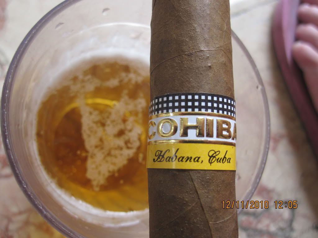
The font of 'Habana, Cuba' is wrong on yours, bro. Look closely at the real one you posted then at your band. Most glaringly, the "C" in Cuba.
I usually wouldn't go by bands alone but with Jamaica in the mix, that's red flags to me.
__________________
That's when I got it. - Tristan (Shack XX) |
|
|
|
|
02-02-2012, 03:58 PM
|
#17 | ||
|
Gentlemen, you may smoke!
|
Quote:
Quote:
|
||
|
|
|
|
02-02-2012, 04:01 PM
|
#19 | |
|
Gentlemen, you may smoke!
|
Quote:
Don't feel too bad, if it tastes good, just be glad it wasn't a complete dog rocket. It's gotta be a good feeling knowing that at least it was a good smoke, real or not. That's what happened to a buddy of mine when he went down to Mexico, came back with some fake Cohibas that were just awful tasting. |
|
|
|
|
|
02-02-2012, 04:08 PM
|
#20 |
|
Wandering aimlessly

|
Another thing I noticed is that in the picture of the authentic band, there is some black between the gold edge and the bottom row of white squares. On your band, the gold cuts through the bottom row of white squares, with no black in between.
The embossing also seems to be too pronounced. I'm no expert though. Just pointing out some differences in the pictures. |
|
|
|


 Linear Mode

